The Best Kitchen Cabinet Colors That Make Homes Look Instantly Expensive
Kitchen cabinets take up so much visual space that their color can change the perceived value of the entire home. The most expensive-looking cabinet colors are not always the trendiest or darkest. They are colors with controlled undertones, a flattering finish, and a strong relationship to counters, flooring, hardware, and light. A thoughtful cabinet color can make basic doors look more custom, calm down a busy kitchen, or give a simple room architectural weight. The secret is choosing a shade that looks intentional in the home, not just attractive on a paint card.
A: Warm white, taupe, deep green, navy, charcoal, and refined wood tones often look high-end when coordinated well.
A: Yes, especially warm whites with quality finish, good hardware, and thoughtful counters.
A: They can, but good lighting and pale counters can keep dark colors elegant rather than heavy.
A: Greige can be very safe when its undertone works with floors and stone.
A: Well-scaled brass, polished nickel, or refined black hardware can all work when proportion is right.
A: Only if the contrast grounds the room or supports the layout; random contrast looks less refined.
A: Refined wood tones such as white oak and walnut are very strong in high-end kitchens.
A: Durable satin or low-sheen finishes often look polished and practical.
A: Test large samples beside counters, tile, floors, and hardware in real kitchen light.
A: Warm white, soft greige, taupe, muted green, navy accents, and quality wood tones usually appeal broadly.
Expensive Color Starts with Undertone
Cabinet color succeeds or fails through undertone. A white cabinet can look crisp, creamy, gray, or yellow depending on the light and surrounding materials. A green can feel refined or muddy. A navy can look tailored or harsh. Expensive-looking kitchens usually have undertones that agree with the countertop, backsplash, floor, and wall color.
Before choosing any cabinet color, place samples vertically in the kitchen and look at them throughout the day. Cabinet doors catch light differently than walls. A color that looks perfect flat on a table may shift dramatically once it covers an entire bank of cabinetry.
Warm White Looks Classic When It Is Not Stark
Warm white cabinets remain one of the safest ways to make a kitchen feel bright and valuable. The expensive version is not cold builder white. It has enough warmth to relate to stone, wood, and natural light without turning yellow. This subtle warmth makes the kitchen feel layered rather than sterile.
Warm white works especially well with unlacquered brass, polished nickel, pale oak, marble-like counters, and handmade tile. It can also make a smaller kitchen feel larger. The key is avoiding a white that fights the floor or makes the countertop look dingy.
Greige Adds Quiet Sophistication
Greige cabinets sit between gray and beige, which makes them useful in homes with mixed undertones. A good greige can soften cool stone, relate to warm floors, and feel more custom than plain white. It is especially effective in kitchens that need calm rather than drama.
The danger is choosing a greige that turns flat or muddy. Samples should be tested beside counters and flooring. The best greige shades have enough depth to define the cabinetry and enough softness to stay timeless.
Mushroom and Taupe Feel Tailored
Mushroom, taupe, and putty cabinet colors can make a kitchen feel quietly expensive because they suggest custom millwork. These shades work well in transitional homes, older houses, and kitchens with natural stone or warm wood details. They bring depth without demanding attention.
Hardware matters with these colors. Brass can warm them, black can sharpen them, and polished nickel can make them feel classic. The finish should be smooth and refined because taupe shades can look dull if the paint quality is poor.
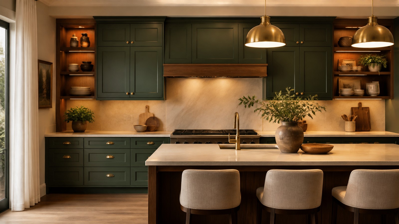
Deep Green Creates Richness
Deep green cabinets can look luxurious when the undertone is controlled. Olive, forest, and smoky green shades work well with stone counters, aged brass, walnut, oak, and creamy walls. Green brings a sense of permanence because it connects the kitchen to natural color rather than pure trend.
The most expensive greens are usually muted. Overly bright emerald or blue-green can date quickly unless the architecture supports it. A softened deep green gives the room character while still feeling livable.
Navy Works When It Has Depth
Navy cabinets can make a kitchen feel tailored, especially on an island, lower cabinets, or a butler’s pantry. The best navy shades have depth and a slight softness. They should not look like primary blue under daylight or black under evening bulbs.
Navy pairs beautifully with warm metals, white counters, oak floors, and classic tile. It also needs good lighting. In a dark kitchen, navy can become heavy unless balanced with pale walls, reflective counters, or plenty of open visual space.
Charcoal Adds Drama Without Pure Black
Charcoal cabinets can feel expensive because they bring contrast and architectural weight. Compared with pure black, charcoal is often easier to live with because it has undertone and softness. It can look modern, classic, or industrial depending on the door style and hardware.
Use charcoal carefully in small or dim kitchens. It works best when balanced with warm wood, strong lighting, or pale counters. A charcoal island can be a safer choice than full charcoal cabinetry if the room needs drama without darkness everywhere.
Soft Blue-Gray Can Look Coastal or Classic
Blue-gray cabinets can make a kitchen feel custom when the color is muted and grounded. This family works well in coastal, cottage, and traditional homes, but it can also suit modern kitchens when paired with clean lines. The expensive version is subtle, not pastel.
Blue-gray needs careful coordination with countertops. Cool counters can make it feel crisp, while warm counters can make it feel more relaxed. If the floor is very warm, choose a blue-gray with enough gray to bridge the palette.
Natural Wood Tones Count as Color
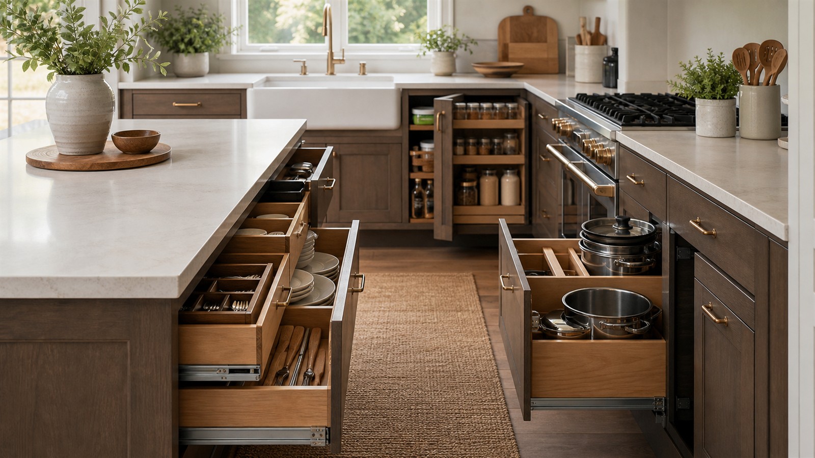
Wood cabinetry is a color decision as much as a material decision. Pale oak, walnut, rift-cut white oak, and warm mid-tone woods can make a kitchen look expensive when the grain is consistent and the stain is controlled. Natural wood adds depth that paint cannot fully imitate.
Avoid overly orange or blotchy stains if the goal is a high-end look. Modern expensive wood cabinets tend to have calm grain, simple door profiles, and finishes that feel close to the material. The wood should look selected, not merely stained.
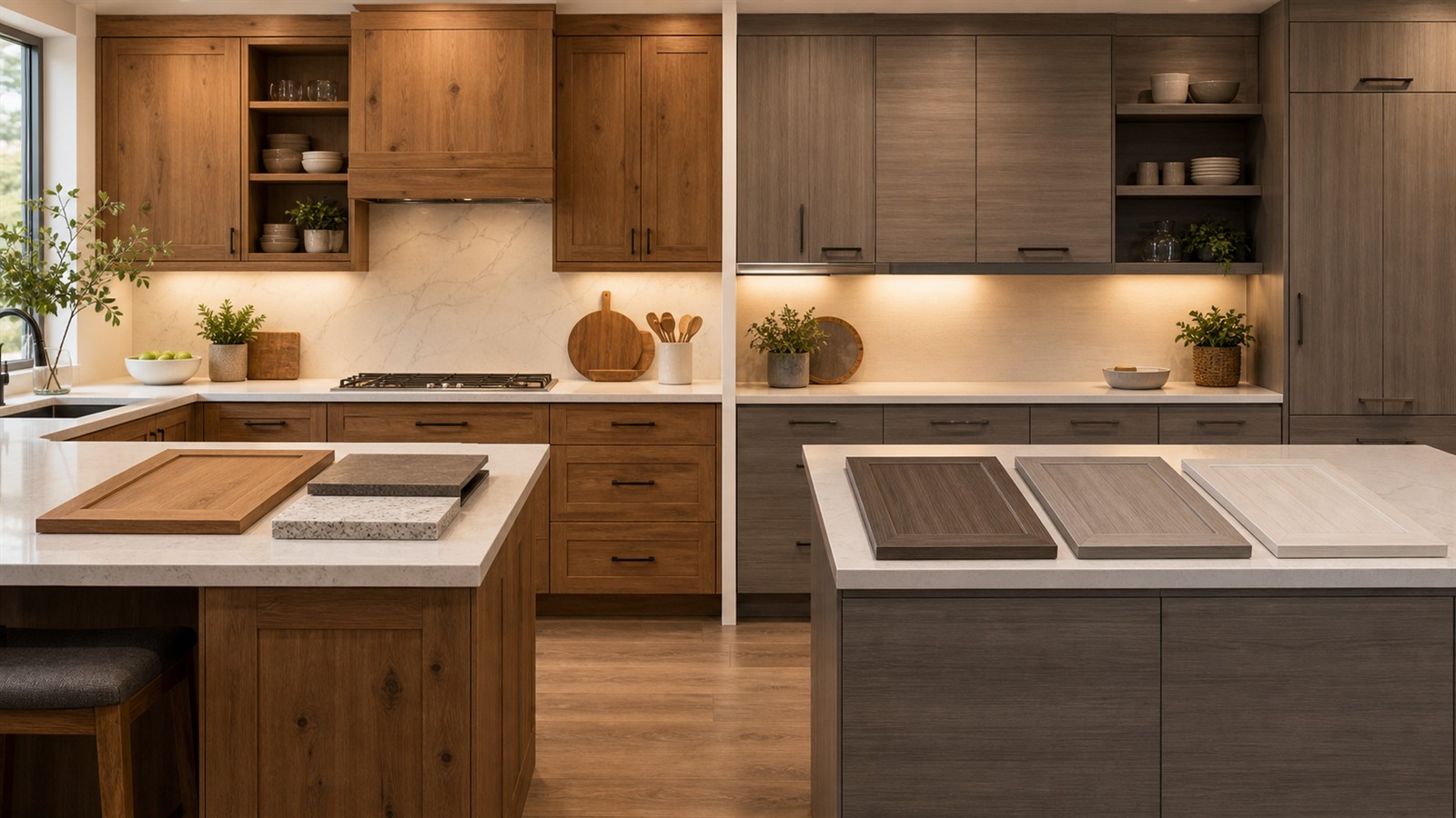
Two-Tone Cabinets Need a Clear Reason
Two-tone kitchens can look expensive when the color split supports the architecture. A darker island with lighter perimeter cabinets can ground the room. Wood lowers with painted uppers can add warmth. A tall pantry wall in a deeper shade can create built-in presence.
Two-tone choices look cheap when they feel random. The colors should relate through undertone, contrast level, or material. If the split does not solve a visual or functional problem, one well-chosen cabinet color may look more refined.
Finish Quality Changes Everything
Even the best color can look inexpensive if the finish is poor. Brush marks, uneven sheen, sticky paint, and chipping edges undermine the effect. Expensive-looking cabinets usually have a smooth, durable finish with a sheen that suits the door style. Satin and low-sheen finishes often feel more current than high gloss in residential kitchens.
Painted cabinets also need proper prep. Cleaning, sanding, priming, curing time, and durable topcoats matter. A sophisticated color cannot compensate for a rushed finish.
Hardware Can Elevate or Flatten Color
Cabinet hardware acts like jewelry, but it should not overpower the color. Warm brass can make green, taupe, and navy feel richer. Polished nickel can sharpen warm white or greige. Black hardware can look crisp, but too much black can make some cabinet colors feel ordinary.
Scale matters as much as finish. Long pulls can modernize slab doors, while knobs and latches can support a classic look. Hardware should feel proportionate to the cabinet door and consistent with the kitchen’s architecture.
Lighting Decides the Final Impression
Cabinet color is never separate from lighting. North-facing kitchens may cool down warm colors. South-facing rooms may intensify creamy whites. Under-cabinet lighting can change how lower cabinets and counters read at night. A color that looks expensive in daylight should still look good after sunset.
Test samples under the bulbs that will actually be used. Warm bulbs can flatter taupe, green, and wood. Cooler bulbs may make gray or white cabinets feel cleaner but can also make the kitchen feel harsh.
Use Color to Make Simple Cabinets Feel Built In
A well-chosen cabinet color can make basic cabinetry look more architectural. Painting a full-height pantry wall in one rich shade, matching trim to cabinets, or carrying color onto end panels can create a custom impression. Expensive-looking color is often about continuity.
This is especially useful in remodels where cabinet boxes are staying. Color can unify old and new elements, hide awkward transitions, and make the kitchen feel planned. The shade should support the room’s bones rather than distract from them.
Choose the Color That Belongs to the House
The most expensive-looking cabinet color is the one that feels inevitable in the home. A historic house may want softened white, taupe, or deep green. A modern home may suit charcoal, oak, or quiet greige. A coastal home may carry blue-gray beautifully. Context makes color feel valuable.
Trends can inspire, but the house should have the final vote. When cabinet color relates to architecture, light, and materials, the kitchen looks less decorated and more designed. That is what creates the instantly expensive impression.
Sample Larger Than You Think
Tiny paint chips are nearly useless for cabinet decisions. Cabinet color covers doors, drawer fronts, side panels, crown, toe kicks, and sometimes trim. A small chip cannot show how much color will accumulate across the room. Large painted boards or sample doors give a much better sense of depth and undertone.
Move samples around the kitchen. Hold them beside the sink, near the floor, under the upper cabinets, and next to the brightest window. Expensive-looking color survives all of those views. If a shade only works in one corner, it may not be the right cabinet color.
Coordinate with Trim and Walls
Cabinet color does not need to match trim, but the relationship should be intentional. Warm white cabinets beside cool white trim can make one of the whites look wrong. Deep cabinets beside stark walls can feel abrupt. A subtle wall color adjustment may make the cabinet color look much more expensive.
In open-concept homes, nearby wall color matters even more. The kitchen may be seen from dining and living spaces, so cabinet color should belong to the broader palette. A beautiful shade can lose its effect if the surrounding walls fight it.
Let Countertops Set the Temperature
Countertops often decide whether a cabinet color feels warm, cool, crisp, or muddy. Creamy stone can make cool white cabinets look icy. Blue-gray counters can flatten a warm greige. Wood counters can soften deep colors. The cabinet color should be chosen with the counter, not before it.
If the countertop is already installed, let it lead. Pull undertones from veining, flecks, or background color. A cabinet shade that quietly repeats something in the counter usually looks more custom than a color chosen in isolation.
Use Resale as a Boundary, Not a Cage
Resale matters, but it should not force every kitchen into the same white cabinet choice. Buyers respond to kitchens that feel cohesive, cared for, and appropriate to the house. A muted green, refined taupe, or rich wood cabinet can be more memorable than a generic white kitchen when it is executed well.
The boundary is extremity. Highly saturated, novelty, or awkwardly trendy colors may shrink the buyer pool. Sophisticated colors have depth, restraint, and a relationship to permanent materials. That is what keeps personality from feeling risky.